
Software Selection & Tutorials
4 Most Common ClickUp Views Mistakes
This post may contain affiliate links which may compensate us at no cost to you. See details here.
ClickUp Views can be a lot to manage if you don’t have them set up the right way. If you've used ClickUp for more than a minute, you’ve probably already experienced a sense of confusion (and made some
ClickUp Views can be a lot to manage if you don’t have them set up the right way. If you've used ClickUp for more than a minute, you’ve probably already experienced a sense of confusion (and made some mistakes along the way) with the ClickUp Hierarchy.
Even more so, with ClickUp Views, this sense of being lost is pretty darn common. This is especially true when people in your Workspace are making some of the most common mistakes that we see when setting up those ClickUp Views.
In this video, we’re going over the 4 most common mistakes ClickUp beginners tend to make when it comes to setting up their Views inside ClickUp, and what you can do to make navigating around your ClickUp account more efficient.
Let’s dive in.
ClickUp View Mistake #1: Requiring All Views

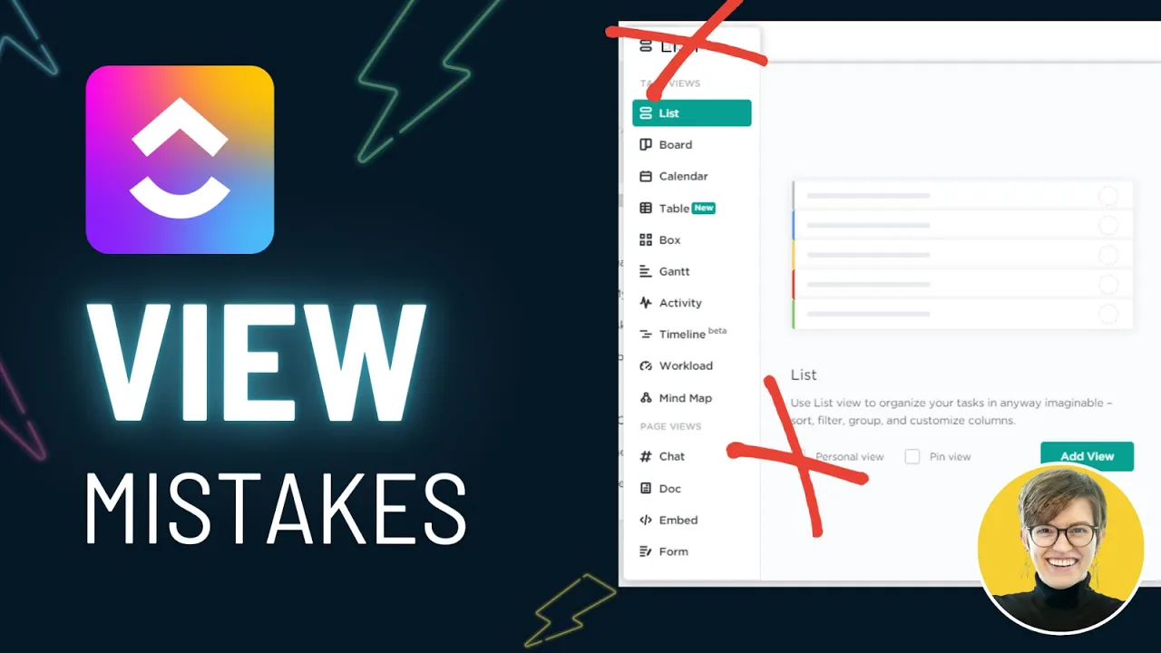
The first mistake I see happening with ClickUp Views: having all of your default views on.
For example, I go into someone’s ClickUp account, whether it’s someone I’m consulting for or someone in the ProcessDriven Membership who’s asking for some feedback, and they’re telling me that they’re having people getting lost in their views.
Then, I see Activity, Gantt, Box, List, Board -- basically every single view that ClickUp offers (which is a wide variety right now) added into their ClickUp account. This most likely happened because, in their Space Settings, they have required all views to be enabled. They’ve checked every single box, and so when someone goes into their ClickUp account, they see countless views that they may or may not actually need.
Fortunately, this is a very quick thing to solve!
When you see generic views with generic titles, and they don’t have anything set up in them, the solution is to disable the views you don’t actually need. Pretty simple. With admin permissions, we will go into our Space Settings, go to More, and All Space Settings. From there, we will disable all default views that we don’t need.
People tend to enable all of them because they think, “Oh, of course, I might want a timeline view. I don’t want to limit my people.” But what they don’t realize is we aren’t giving people the option. This is setting requirements for your entire team, and in almost every circumstance, it’s better not to require a view and instead allow people to add it when they need it (versus requiring everything and causing more confusion).
Pro Tip: If you're not sure which Views should be required...
If you’re not sure whether or not you should require a view, a good rule of thumb is: Do you have a view template for it?
If I was sitting here thinking, “Should I require Board view? Should I make that something that we always have on?”
Well, if you require this view, go to the next tab, View Templates. This is where you can define default settings for views when you create them, and if there’s not a particular view style that you like to have, or if you never even set this up, odds are your preferences and your reasons for having that specific view are not strong.
There’s not a good case for having it. If you don’t have a good view that you like to see, then you probably don’t need that view.
At the same time, if you’re someone who has a list for every client -- that’s your situation, and your list for every client is always set up the same way -- you always want your views to look a certain way. That’s a great instance where requiring views and setting those default view types could be a huge time saver.
Again, just like many areas of ClickUp, do what will work for you.
If you don’t know what I’m referring to with view templates (or just don’t want to get into it), the best starting point is to get rid of all of the other views you don’t necessarily need and take a look at how much simpler it seems.
We went from having a wall of view options that I could click around and get lost in -- to just two views, purpose-built for this particular list.
You can learn more about this View mistake starting at 01:16.
ClickUp View Mistake #2: People-specific Views

The second mistake we see when it comes to ClickUp Views is not setting up your views in the most efficient way. Sometimes, we create views for reasons that we think are good, right?
We create views because we want to ensure that Jane can see her tasks. We also want to make sure that John can find his tasks. So, we create many different views to filter and segment and make sure that people can find what they need.
Again, we’re trying to think about consolidation here. When we’re creating person-specific views, that’s usually an opportunity to leverage a feature called Me Mode rather than having everything segmented out by the person.
Have you heard the news? Our ClickUp Course available exclusively inside the ProcessDriven Membership just got a HUGE upgrade! Check out a sneak peek of our newly updated Membership, or sign up to join our Community.
If you create person-specific views, let’s swap that out and start incorporating Me Mode into your views. I promise it’s a lot more efficient than creating one thing for John and assigning it when anything says “John,” then doing the same thing for Jane and setting up all these different views. That takes a lot of time.
Instead, we’re going to create a generic view called My Tasks. We’re going to have it say My because whoever is looking at that view will see stuff assigned to them only. We’re going to do that by altering our view to always force things into Me Mode.
You can find that under More Settings and default to Me Mode. This will not only look for tasks assigned to a person, we’re also including comments and checklists.
It’s more comprehensive filtering, and it’s going to make sure that nothing gets missed accidentally. Having one view called My Tasks is way more efficient than having 15 views, one for every team member.
If you’re someone who finds yourself making person-specific views, try swapping that out for something more useful to everybody. Unless you’re creating personal views for yourself only, you're adding a lot of clutter to everyone else’s life when you create this very long, too many options kind of situation.
Watch Layla map this out on-screen, starting at 04:50.
ClickUp View Mistake #3: Ignoring Subtasks

The third mistake I see when it comes to ClickUp views is completely forgetting about your subtasks. Often, folks who are new to ClickUp don’t realize that they have options regarding how you view your subtasks inside your views.
You have three ways to be precise.
Collapse All: subtasks are collapsed, meaning they are smushed in
Expand All: subtasks are directly underneath the parent task
View Separately: subtasks look almost the same as a parent task and allows us to sort things individually
Each of these sorting mechanisms has its place, but the biggest mistake I see is people ignore this setting altogether.
It’s imperative when you're designing your views to think about how your data is organized (and organize your views and your use of subtasks in those views accordingly).
If the idea of using tasks to mean something more, like a container, is confusing, you can watch this video dedicated to ways you can use different data in ClickUp.
For now, when you create your views, think about subtasks. Do not leave this as just the default option of collapse all. It would be best to question what will make the most sense for you and your team. Ask yourself, “What’s going to be the most helpful?”
If I was looking at overall deliverables, I would probably want all of my subtasks collapsed. (Because I just want an overview of all deliverables.)
If I was trying to create a view for the doers to focus on what tasks they need to do on a given day, the opposite is true. I would want to create a view where I only show things that are not a deliverable and only show tasks and perhaps group them by the due date.
In this way, I am showing data differently because of what the information needs when creating your views. It would help if you looked at and thought about the Subtask Settings when creating views.
Treat this as a crucial variable that changes the entirety of what your view looks like.
See where and how to manage your Subtask Views starting at 7:23.
Confused about ClickUp Views? Check out our article/video we did all about setting them up correctly, right here!
ClickUp View Mistake #4: Default View Names

Mistake number four when it comes to ClickUp Views is, fortunately, a much simpler one.
If you’ve heard us talk about data types and subtasks and you’re new to ClickUp, and you’re like,
"Oh my gosh, I thought this was a beginner tutorial and it's really feeling like an intermediate one."
Here’s an easy one for you that you can implement right now!
The mistake here is having you inherit the names set up by default. There’s a trend here, by the way. Most of these mistakes are just when you leave the default settings and don’t question them.
It’s not rocket science, but it is something to be aware of. So, in this case, we might have things like a Board view called Board or a Calendar view called Calendar. It’s like a little kid naming their pet mouse, Mouse.
Want to know why building a ClickUp Hierarchy based on departments doesn't actually work in ClickUp? Check out our FREE ClickUp webinar here.
We can do better because this is not overwhelmingly descriptive to see. To fix this, I want you to start treating views as reports. Based on the title of the view, we should be able to know what it's showing me and why I would want to click on it.
So, let’s say we had a view called Web Design Tasks. Cool. I know what I’m signing up for when I click on that. If I had a view called Overdue Tasks, I could easily guess what that view would tell me and what it would report.
Let’s say we leave our views with the default settings, but we add some cool filters, like having anything with due dates in the next seven days grouped by priority flags, sorted by the assignee.
This view now looks gorgeous. I saved my work so that my view settings are saved -- but now nobody knows what happened. They’re going through their workday, and they go to this Board view, and they see no tasks, and they think, "Okay, there's no tasks to do here. Moving on".
We don’t want that. So, we need to be clear in what our views are doing. In this case, I want to label these upcoming tasks by priority. It doesn’t have to be a lot, but this is showing me only upcoming tasks, and it’s grouped by priority. That’s what I’m going to see when I come in there.
So, if I’m someone who’s trying to get to work and I click on this specific view, and I don’t see any tasks there, I can assume, "Oh, this is only upcoming tasks".
It is essential to name our views to ensure tasks are not missed. The cool things you create, like that fabulous view showing your upcoming tasks by priority, can now be seen by other people on your team and help them, so they don’t have to create that view for themselves.
I hate to see when people create tons and tons of great resources in personal views. Everything’s personal -- they make a personal dashboard, a personal document, a personal Wiki, a personal SOP.
Let’s share the love, right? The whole point of process and systems work (and ClickUp) is to help you work more effectively. If you figure out a way to help yourself do work more effectively, there’s a good chance that other people in your orbit could benefit from that as well.
Don’t hoard. Share. Naming your views is one step towards that. 😉
Learn more about using the right naming conventions when organizing your Views, starting 10:31.
BONUS ClickUp View Mistake #5: Browsing your Views

I promised you four mistakes, but I want to overachieve here and throw you a fifth because I think it's a good one.
If you find yourself doing what I did in this mockup where you’re touring your Workspace, trying to find something. You’re just clicking and clicking. That is a sign that something more than just your horizontal hierarchy is incorrect.
I really want you to start thinking about the vertical hierarchy and horizontal hierarchy, as we call it here at ProcessDriven. We created these terms to give you a framework to start thinking about how ClickUp is organized.
I know this is an extended metaphor, but when I see people going through their ClickUp hierarchy, over and over again, searching for views...it feels like somebody who goes to the library, navigates all the shelves, randomly browses, finds a book, opens the book inside the library, starts reading a few pages, puts it back on the shelf, leaves, and does that every time they want to read a book from the library.
I would suggest you go to the library, find a book you like, and check it out.
How do you do that in ClickUp? Well, go to the “library.” Go to your vertical hierarchy and horizontal hierarchy. Find a view that you like that’s helpful and that you will need to reference in the coming days. Take it and favorite it.
You can do the same thing with a list, which will favor the default view. You can do the same thing with Docs and with Dashboards. Whatever it is, add it to your favorites with a name that makes sense to you.
No matter where I am in ClickUp, the Favorites bar is going to be with me. It’s like I took the book, and I checked it out of the library. That is much more convenient than going back to the library every time I want to read a page or every time I need to find the view.
So, when you’re starting your day in ClickUp, almost everything you need should be in your Favorites bar. If you find yourself saying, “Oh, where am I going? Okay...”
*proceeds to click click click around*
Let’s bust that. Start using your favorites.
Check the book out of the library and keep the things you need at the ready so you’re not wasting so much time looking for information that’s a huge time waster.
It’s partially a view mistake and partially a workflow inefficiency. And I want to call your attention to it because you guys want to improve your ClickUp skills. One of the best things you can do is just change your daily habits. When you start your day, go to your Favorites to find the resources you need.
See how you can find what you need easier, starting at 13:49.
Until next time, enjoy the process.
Looking to master the basic features of ClickUp in just one day? Enroll in our How to ClickUp Mini Course and master the basics in just one day!


IF YOU'RE NOT SURE WHERE TO START, TRY