In our ongoing effort to help make ClickUp easier for everyone, we’re going over 5 tips to make your ClickUp account less confusing to you and your team.
Whether you’re new to ClickUp or a seasoned pro, these tips will make ClickUp easier from day one of implementing them!
(Want more ClickUp tips? Check out Part 1 of this “series”, 5 Easy Ways to Simplify ClickUp (ClickUp Tips for Beginners)
⭐ Take our FREE Hierarchy Quiz to learn whether any process should be in a Space, Folder, or List.
⭐ Master the basics of ClickUp in just ONE day with our How to ClickUp Mini-Course.


ClickUp Tip #1: Clarify how individuals should prioritize tasks
It’s no secret: when it comes to making ClickUp work for you, we are firm believers in mastering Views first to make the experience better for everyone.
With those Views worked out, the first thing you’ll want to do is start to clarify how individuals should prioritize tasks.
The goal is to help people answer the burning question: “What should I do next?”
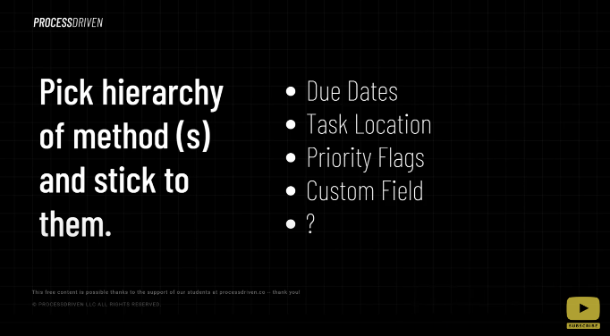
There are a lot of different ways to figure out prioritization, but whatever method you’re going to go with, identify it and communicate it. Otherwise, ClickUp can just feel like a big pile of to-dos with no real rhyme or reason to how it’s all laid out when it comes to deciding what to do next.
Typically, teams will pick one method as their primary form of deciding priority.
Some ways you might want to prioritize tasks can include:
- Due dates
- Task location
- Priority flags
- Custom field
- A custom method due to your own needs
One of the most common ways to determine priority is due dates. If you decide to use due dates, communicate with your team that they should always start with overdue tasks. Then work on tasks due today and then work your way ahead from there.
Other teams might prefer to skip due dates entirely and just work off of priority flags.
(Learn more about how we use priority flags vs. due dates in this video.)
If you’re looking to use the mix-and-match approach, you might decide to use both.
Remember, your main goal here is just to answer the question, “what should I do next?”. Just make sure that your views, your internal ClickUp training, and your overall structure reinforces that type of decision-making criteria.
Layla dives into prioritizing starting at 0:16
ClickUp Tip #2: Share screens to confirm layouts
Number two is an important one that came up when we recently brought on a team member.
She was going through all of the training to learn how to use ClickUp for the first time. (We have a good amount of stuff to help her through that.) However, she pointed out early on that she was really confused with some of the initial training because it turns out that her Workspace was in Modern Layout and Layla’s Workspace was showing things in Simple Layout.
Just to quickly clarify: Sidebar Layouts are the different ways that ClickUp can look. It rearranges information using the settings gear on the sidebar. If you click on that sidebar and adjust your sidebar settings, you can flip between different layouts. Layouts are definitely based on personal preference. For instance, Layla is a big fan of the Simple Layout. While some of our team seems to prefer the Modern Layout and a lot of our clients seem to enjoy the Clean Layout.
(Still not sure the differences between layouts in ClickUp? Check out Why My ClickUp Looks Weird: ClickUp’s New “Simple” Sidebar Layout)
There are three different interfaces in ClickUp. One thing that you can do to make your ClickUp experience with your team much simpler is to either ask everybody to make sure that they’re on the same sidebar layout or at least address the differences.
When you’re providing training, building SOPs, sharing screenshots, always make sure that the person who’s looking at the screenshot is able to replicate exactly what you have. One easy way to do this is to set rules like, “Every new employee needs to use a Modern Layout. If you want to change, that’s fine. But we are only to be providing SOPs and documentation showing things in the Modern Layout of ClickUp.”
No matter how you decide to solve this, one important step remains true: Make sure you know what screen layouts the people are using to simplify communication.
Layla explains sharing screens in more detail at 2:11
ClickUp Tip #3: Monitor and discuss regularly (weekly!)
Next step – monitor and discuss regularly/weekly. This is one that’s a little bit more on the business workflow side but in many ways, the systems have an impact on how your ClickUp software works. (If you’re not sure about the differences between a system and software, check out Systems versus Software (And How They Differ.)
We want to make sure that whatever rules, goals, or objectives we have for our ClickUp account, that we are actually bringing that up in front of our team.
For example, we recently cracked down on the number of overdue tasks we had inside our ProcessDriven ClickUp account.
We could sit here and say “we never have overdue tasks!”, but to be honest: we’ve got overdue tasks.
To rectify the sheer abundance of overdue tasks we seemed to be collecting a few weeks ago, we started pulling up the to-do list of everybody, sharing the screen, and talking through why they were overdue during our bi-weekly team meetings.
The first time we did this, they were probably thirty overdue tasks or sub-tasks that had fallen behind for one reason or another. The vast majority of them were actually done but weren’t marked done or were simple oversights – but still thirty tasks.
Two weeks later when the next meeting rolled around, there was a big flurry of tasks being moved from “In Progress” to “Closed”.
Now, each team meeting is allotted less and less time devoted to discussing overdue tasks. This goes to show the power of accountability and setting up meetings to go over everything. Sometimes, even the act of talking things out can help your team members move things forward.
Layla dives into weekly meeting discussions at 03:42
ClickUp Tip #4: Design for a Vertical Hierarchy that’s consistent
Number four is to design for a Vertical Hierarchy that’s consistent. If you think about your ClickUp account, we’ve got the vertical hierarchy of Spaces, Folders, and Lists.
Then we have the Horizontal Hierarchy, which includes Custom Fields, etc. Together, it makes kind of a matrix of the organization where our tasks fall into much like a spreadsheet.
Should your ClickUp project be a Space, Folder, List, or Task? Take our FREE Hierarchy Quiz to find out!
When you’re designing your ClickUp account, one way to make it very disorienting, especially to new team members, is to constantly rearrange items in your Vertical Hierarchy. We’re not just talking about rearranging as in you found a better way. We’re more so referring here to using Spaces, Folders, or Lists for things that change very quickly.
For example, you may create a whole Folder just for one launch that lasts three days, and then it disappears into another Folder that takes place for the next launch.
Having a hierarchy that tends to shift around a lot can is confusing if the overall containers aren’t clear, with the exception of things like Sprint Lists. (If you want to learn about using Agile and ClickUp, you can learn more about Agile Project Management in ClickUp here.)
Build a ClickUp structure where the Lists, Spaces, and Folders are changing every few months, not every week or every day. They’re more or less set.
To continue to the above example, you could have one Folder where each List is a certain launch throughout the year. That way, people know exactly where to find what they need, when they need it.
Layla dives into vertical hierarchies at 05:58
ClickUp Tip #5: Share containers to avoid “Shared with Me” black holes
The final tip for simplifying ClickUp is to avoid the black holes that are “Shared with Me”.
Shared with Me shows up on the left sidebar of ClickUp. It shows you things where you do not have access to the overall space.
It basically creates this floating area of Tasks, Lists, and Folders that don’t have a “home” in your Guest or limited access view. (Learn more about the ClickUp Guest experience here.)
By sharing broader containers higher in the Hierarchy, wherever possible, you make it easier for your team members to find their way around. You make their view or their experience of ClickUp more similar to your view, which makes communication easier.
For example, let’s say I had a Space called “Clients”, a Folder called “Client A”, and a List called “Website Design”. If you only share the List called “Website Design” and your contractor can only see that List, keeping track of what website design project you’re referring to is going to get confusing.
However, if I share the whole “Client” Folder and share that List inside it, that contractor now has a frame of reference for what exactly that List is referring to.
Layla dives into these containers starting at 07:33
Related Resources
➤ Why My ClickUp Looks Weird: ClickUp’s New “Simple” Sidebar Layout
➤ Agile Project Management in ClickUp