If you’ve ever considered which project management tool to get, you’ve probably heard of both ClickUp and Todoist.
If you’re still unsure which one is best for you, you’re in luck! We’re breaking down key features most people look at when making their final decision and comparing them side by side in this walkthrough.


Not a video person? No worries! We’ll cover all the main points in this article.
Trying to decide between ClickUp and Todoist? This video is for you!
Today we’ll be comparing the task management tool Todoist and the work management tool ClickUp. We’ll be focusing on the following areas:
- Design and Feel
- Features
- Language
- Pricing
Note: This article is not focused on convincing you that ClickUp is better than Todoist. Although ClickUp is our tool of choice, we’ll be the first to tell you if ClickUp is not for you.
Let’s dive in!
To watch this explanation in video format, watch the video at the top of this article at timestamp 00:00.
Comparison #1: Design and Feel
ClickUp’s home feature, NOTIFICATIONS, AND TASKS
When it comes to ClickUp, we start our day in Home. Here’s what that looks like:
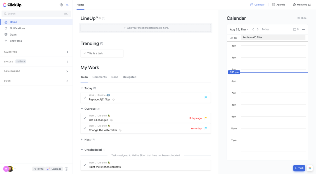
This is where we see all tasks assigned to us, grouped by the due date. This is pretty much our only option when we’re in the Home area, but we do have the option to customize other areas of our ClickUp.
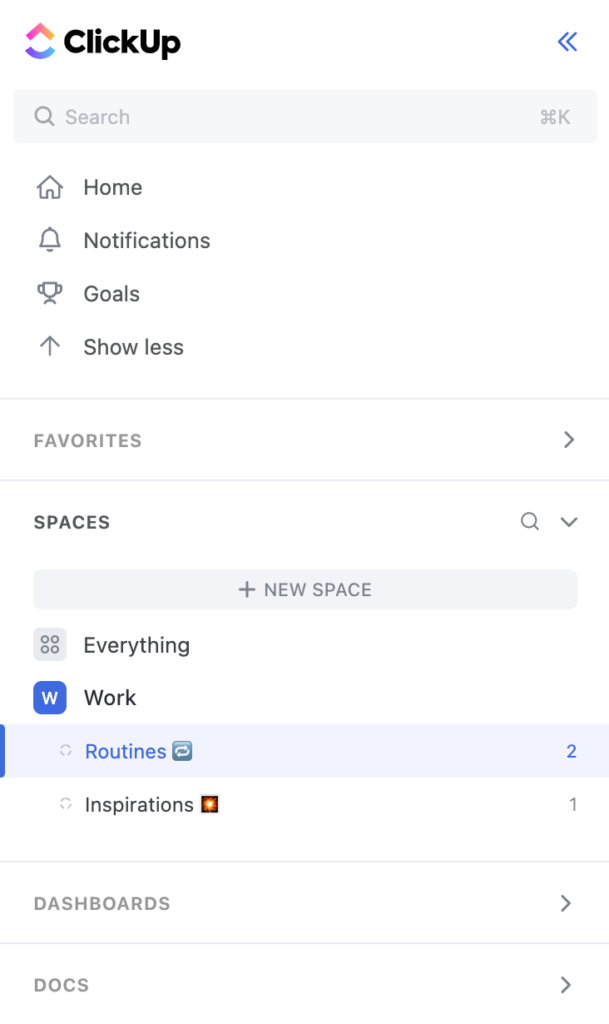
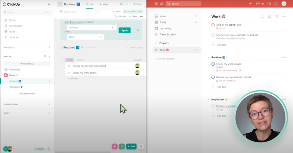
Right under Home, we have Notifications and a few other advanced features. Below that, we have Favorites and, ultimately, our ClickUp Hierarchy, where all of our tasks live.
In ClickUp, tasks live in Lists that look like this:
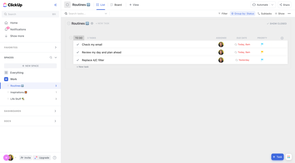
Tasks that live on this List can be moved to other Lists by dragging and dropping, like this:
Or by going inside the task’s settings and selecting another List. Additionally, tasks can live in multiple Lists.
This is essentially what the ClickUp Hierarchy will look like (more or less) across the entire Workspace.
When we start our day, we’d probably want to go into Home first, check our Notifications, and then go into a given task to start working.
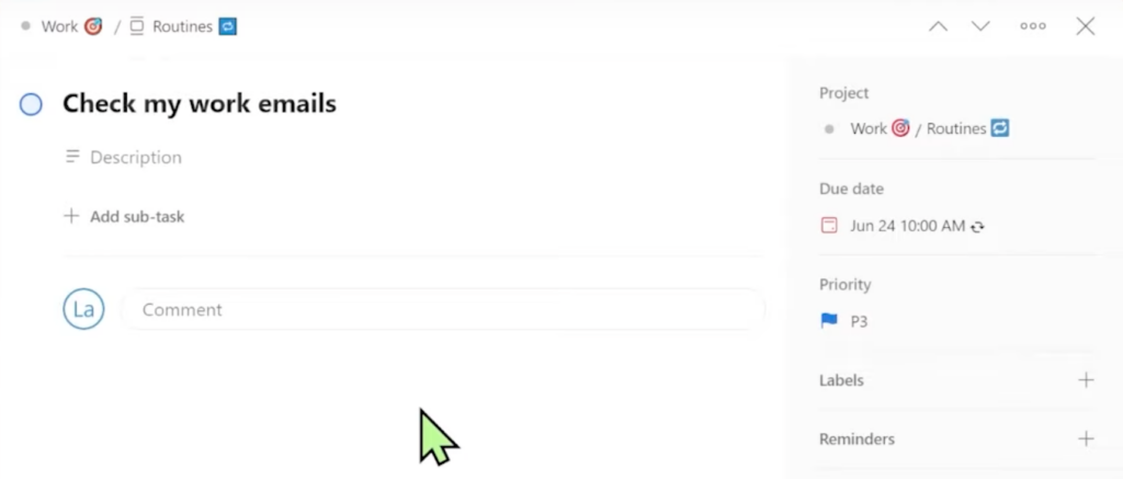
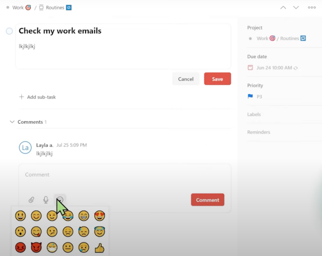
Once we’re in that task, it’s going to look similar to this:
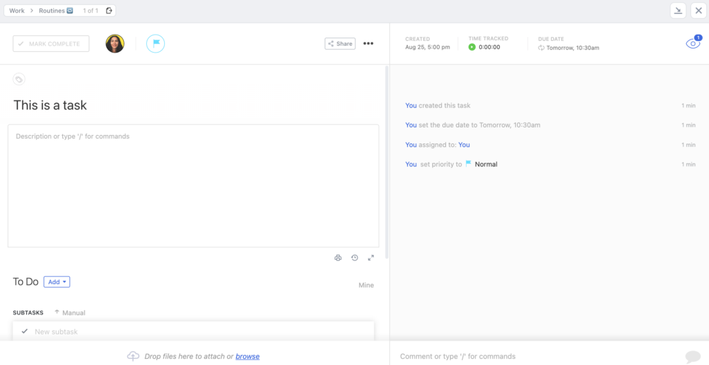
We have a Comments section on the bottom right that acts as a place to communicate with our team or leave notes for ourselves. It comes with multiple format options that are convenient and improve communication with our team.
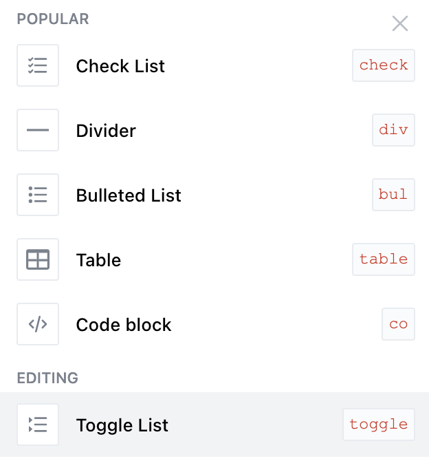
Formatting options fall under the following categories: Editing, Embed, Views, and Task Actions.
So far, this is a general overview of how we’d use ClickUp daily. This is also how ClickUp is going to be formatted throughout. Its aesthetic includes a lot of modals, drop shadows, small fonts, and certain things that only appear when we hover over them.
Note: We are currently comparing ClickUp 2.0, ClickUp’s second official version. However, in late 2022, ClickUp will be releasing ClickUp 3.0. Sign up for our newsletter, The Workin’ Process, to get the latest updates.
Let’s move on to Todoist!
TODoIST’s Inbox feature, Projects, and Tasks
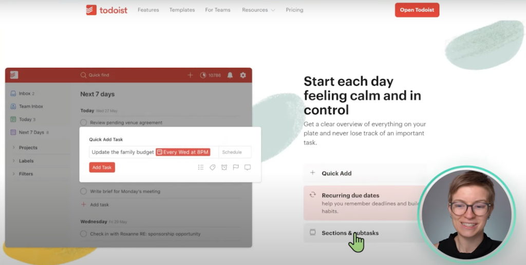
When we first login to our Todoist account, here’s what we’ll see:
Right away, we’ll notice how different Todoist’s interface is from ClickUp.
Similar to ClickUp, Todoist has a Sidebar. However, Todoist’s Sidebar is more minimal, even when expanded.
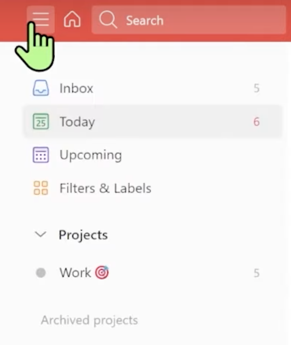
We don’t have many options here outside of organizing our tasks. This is intentional as Todoist aims to be a more focused “to-do” task-based tool.
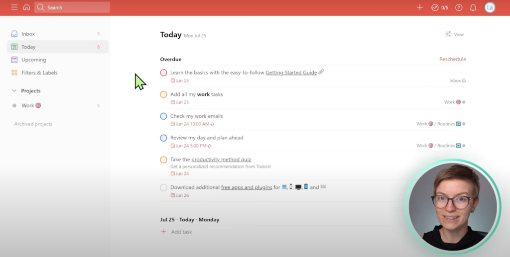
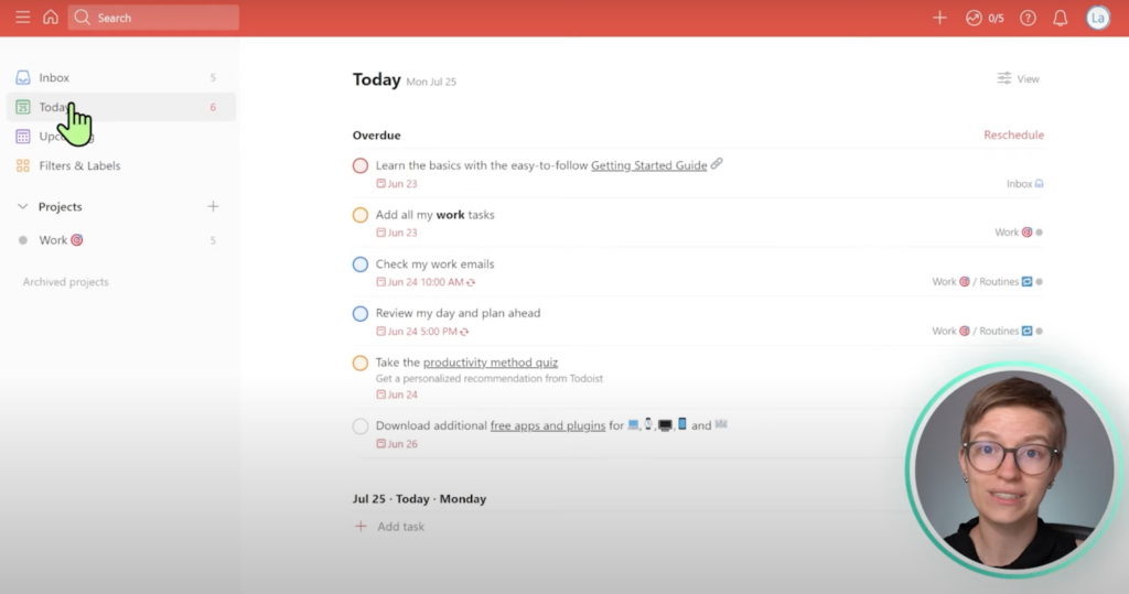
At the very top of our Sidebar Menu, we have our Inbox.
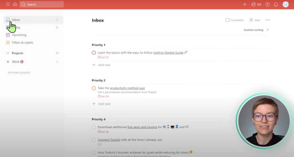
Right under that, we have Today.
These are two different ways to focus on our tasks for any period of time.
Beyond that, we also have Upcoming.
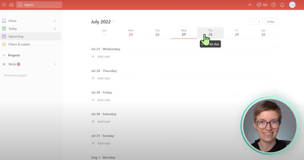
This is similar to what’s incorporated in a ClickUp View, but the way Todoist breaks it out is a lot nicer looking.
Similar to the ClickUp Hierarchy, Todoist’s structure includes Projects instead of Spaces, which is what we have right here in the Work Zone:
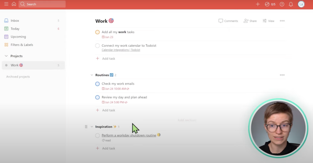
Here we’ll see our tasks grouped in sections, similar to Asana. In general, Todoist is a lot like Asana, and Monday is a lot like ClickUp.
Once we click on a task, we’ll notice it looks a lot like a Trello card:
We have a Task Description and some information, but overall, Todoist’s look and feel are much simpler. We also have a Comments section, which also includes different format options:
However, because Todoist is newer when it comes to Commenting, it’s not quite as developed.
ClickUp vs. Todoist: Side by Side Comparison
Here’s a side-by-side comparison of the two interfaces:
When we compare the two interfaces, the differences are pretty noticeable. Not only is Todoist a bit faster to navigate than ClickUp, but it’s also a lot more minimal, like Notion.
ClickUp is a lot denser. There are tiny icons we can barely see, things that only show up once you hover over them, and some other quirks about its interface that we don’t see with Todoist.
Overall, when it comes to ease of use and design, comparing ClickUp vs. Todoist, Todoist is a bit easier. It’s more calming and well organized. Its font usage is also easier to read, and its interface is more relaxed than ClickUp’s dense interface.
To watch this explanation in video format, watch the video at the top of this article at timestamp 01:34.
Comparison #2: Features
In the last section, Todoist won. Let’s move on to Features, as things will likely take an interesting turn.
Most of us have heard the phrase, “apples to oranges comparison.” This phrase perfectly describes ClickUp vs. Todoist’s Features. Todoist is a to-do app — it’s meant for task management, and it does that well. It’s expanding into team management, but its core features revolve around to-dos.
ClickUp, on the other hand, has a much bolder vision and is more greedy in what it wants to accomplish inside our tech stack.
Not only does ClickUp try to be good at task management, but it also wants to be good at:
- Document Creation
- Dashboards
- Reporting
- Team Chat
- Universal Search
And the list goes on and on.
If we compare these two tools side by side, we’ll notice how different they are. We could take you through every single feature each tool has, like Todoist’s Reschedule button that lives inside our Overdue tasks. Or ClickUp’s Goal feature, which tends to be underutilized.
However, we don’t want to waste anybody’s time.
In general, almost EVERYTHING we can do in Todoist, we can do in ClickUp.
Let’s go through a quick rundown of the equivalent features in both tools so you can make your own comparison.
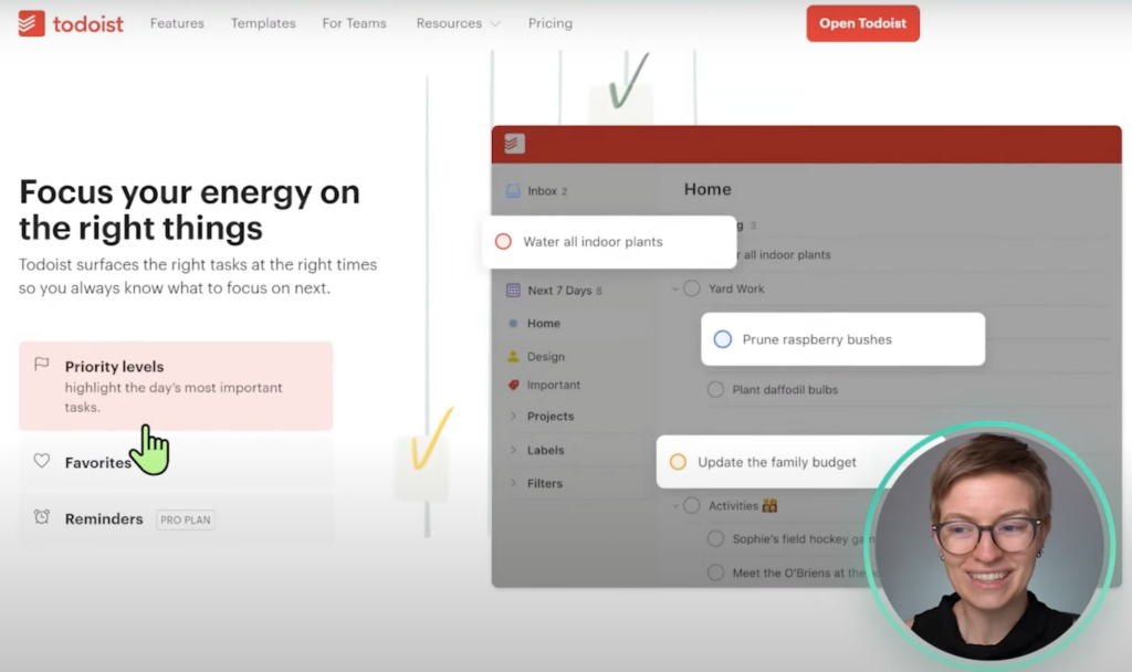
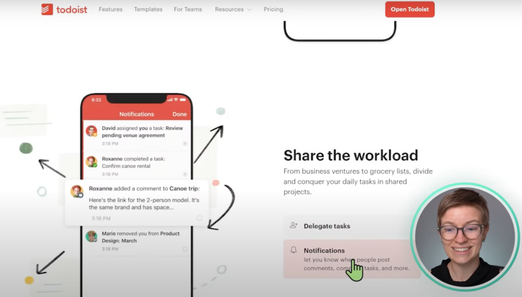
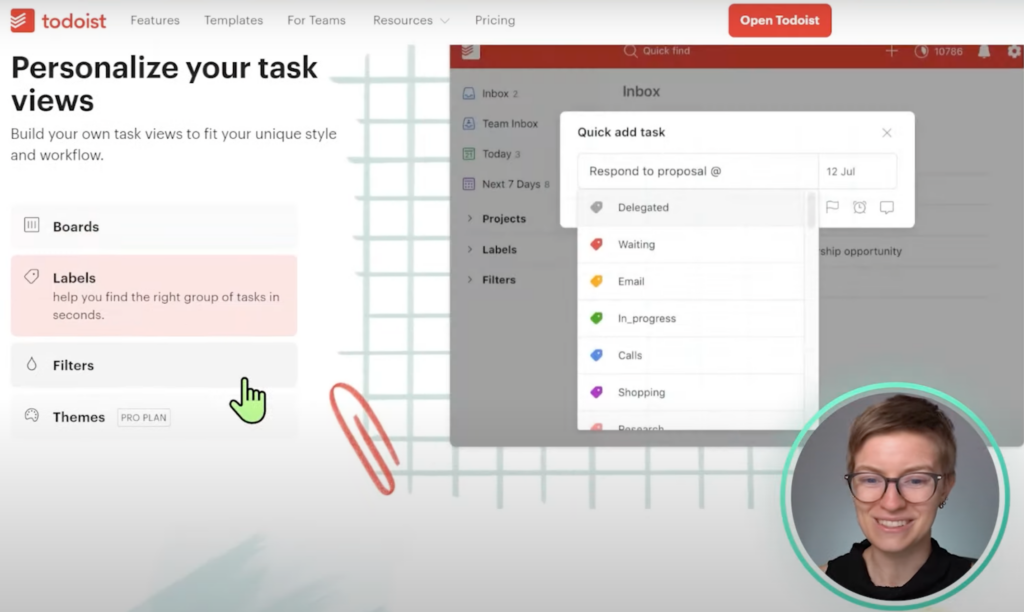
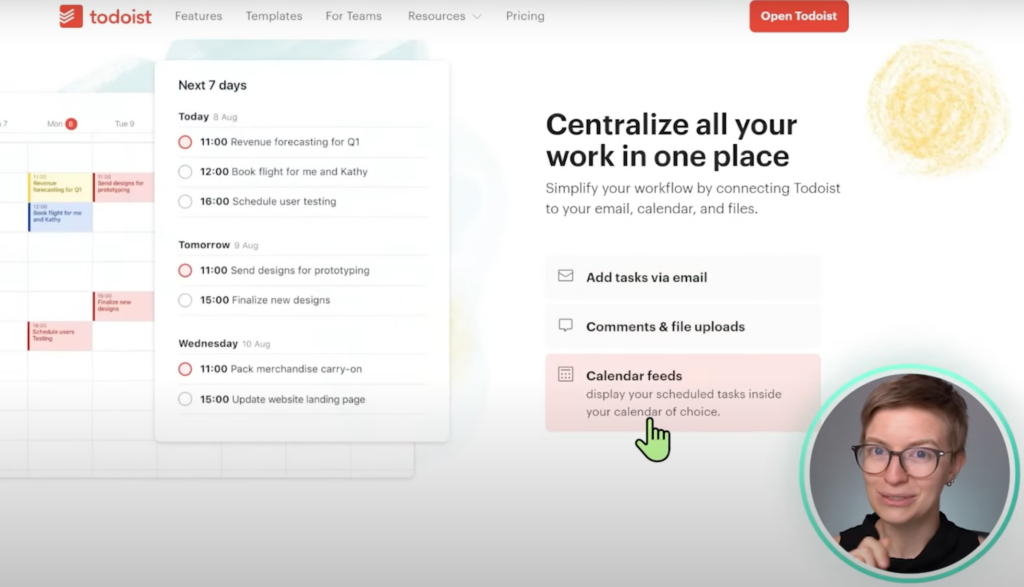
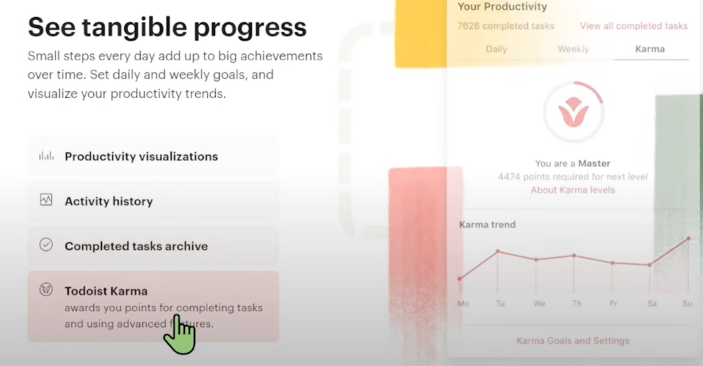
Every Todoist feature in the above images is possible in ClickUp. However, pretty much anything Todoist can do, it does better than ClickUp.
How?
Todoist does a smaller amount of stuff but does it at a higher quality. Whereas ClickUp does a much larger volume of stuff — more features, power, functionality — but at a slightly lower quality than what we see in Todoist.
Since we can do much more in ClickUp vs. Todoist, we’re giving this round to ClickUp.
To watch this explanation in video format, watch the video at the top of this article at timestamp 06:22.
Tired of learning ClickUp the hard way? Maybe it’s time you and your team check out our How to ClickUp Mini Course to master the ClickUp basics in less than ONE day!
Comparison #3: Language
Features are great, right? But if we can’t understand what the features are doing, they will be useless to us. In this section, we’ll focus on the most literal level of understanding we can have: Language.
What languages are these pieces of software in?
In Todoist, we have the level of language support we’d expect from such an established tool. Todoist is currently available in the following languages:
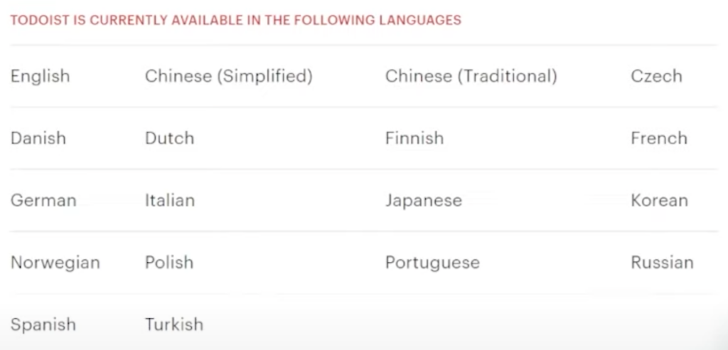
Plus, you can also have different languages based on the app you’re in. For example, you can use the web app in French and the mobile app in English.
When we transition over to ClickUp, we also get what we expect. ClickUp is a much newer tool. It’s U.S.-based and very U.S.-centric.
English and French are the two languages supported by ClickUp, but please note this is limited to the interface only — AKA the words on the page.
ClickUp Support, ClickUp Docs, and all ClickUp Resources are only in English. While ClickUp states Spanish and Portuguese are coming soon (yay!), we wouldn’t recommend ClickUp to anyone who doesn’t feel comfortable working in English.
It’s a no-brainer that Todoist takes the cake in this category.
To watch this explanation in video format, watch the video at the top of this article at timestamp 10:32.
Comparison #4: Pricing
Moving on to everyone’s favorite topic: Pricing.
When it comes to pricing in ClickUp vs. Todoist, at first glance, Todoist is going to appear cheaper.
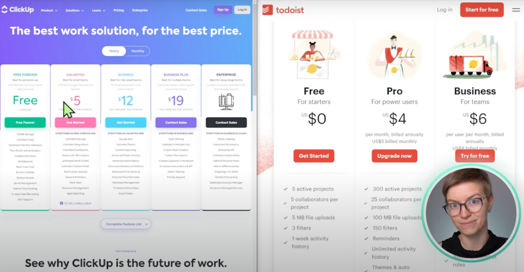
Todoist’s most expensive plan is $6/user/month. Compare that with ClickUp’s cheapest plan, $5/user/month, it appears Todoist is the winner.
🛑 Not so fast! 🛑
Remember earlier when we stated that ClickUp had way more features than Todoist?
For those of us who are looking to get the most out of our investment in a tool, even though Todoist appears cheaper, ClickUp still wins in the Pricing category.
Why?
We will get far more power for each dollar we spend by using ClickUp than we would in Todoist just because of the scope of the platform.
When we decide to purchase Todoist, we know we are getting a beautiful interface, reliability, support, and quality, but only a small feature set.
Whereas with ClickUp, we get a large quantity but a slightly lower quality than Todoist.
To watch this explanation in video format, watch the video at the top of this article at timestamp 12:33.
And the winner is…
So, who is the ultimate winner?
Neither! Both? We don’t know! The answer depends on who’s asking.
Here are some common scenarios to help you with your decision:
If you’re planning on working with a group of people — meaning a team of some kind — we think you’ll find ClickUp is the better option.
If you’re looking to get the most out of every dollar you spend, we think you’ll find ClickUp is the better option.
Now, if you’re someone who’s going to be solo or on a very small team, we think you’ll find Todoist is the best option.
Lastly, if you’re someone who values the reliability and aesthetics of a tool over everything else, we think you’ll find Todoist is the best option.
When our clients are looking to organize their personal lives and don’t want anything too “techy,” we often recommend Todoist. For folks who are a bit nerdy like us and like to go inside a tool, mess around, and use advanced features even as a solopreneur, we tend to recommend ClickUp. ClickUp is the more fun and scalable choice for those looking to do something and grow it into an extensive ecosystem.
Ultimately, the question comes down to which of these tools would you enjoy going into the morning and starting your day?
Usage is the greatest indicator in our experience working with clients in the success of any platform, whether you’re using ClickUp, Todoist, or a spreadsheet.
A crappy tool you can commit to using is better than a fantastic tool that you can’t bear to look at when you start your day each morning.
Just something to keep in mind. 😉
Until next time, enjoy the process!
To watch this explanation in video format, watch the video at the top of this article at timestamp 13:54.
Tired of learning ClickUp the hard way? Maybe it’s time you and your team check out our How to ClickUp Mini Course to master the ClickUp basics in less than ONE day!